
Color Architect
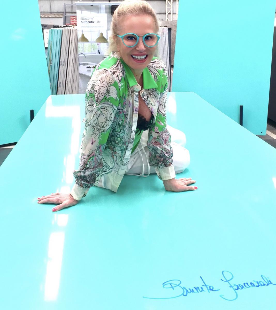
Award-winning architect and interior designer Brunete Fraccaroli believes that architecture and design are progressively linked to people’s lifestyles. She is known worldwide for her use of bold color and often called the “Color Architect.” According to Fraccaroli, a successful project relies on the bespoke details—on the emotional meaning of each projected space. Known for her eclectic and bold style, Fraccaroli creates spaces that are aesthetically pleasing while recognizing a client’s individual needs. As one of the most recognized designers in the world, she offers a differentiated aesthetic with creative solutions.
You are known worldwide for your architectural work in glass and color. What inspired you when you were beginning your career?
I loved color, shine, and transparency, even as a child. My aunt used to bathe my white cat in food coloring to make the cat light blue! My childhood room was filled with brilliant color, and I was already hooked on color long before I became an architect and interior designer.
You’ve worked on projects throughout the globe. Do you see differences in the way certain countries react to color in architecture? Are some areas of the world more receptive to bold color while others are more understated?
Twenty years ago, architects and interior designers were conservative in their use of bold color, but I think that has slowly changed. I began studying color early in my career and was one of the pioneers of using color more liberally in my work. Brazil, Europe, and the United States were reluctant during that time. When I came to the United States to lecture on color in the early 2000s, architects were surprised by my work, but I think it helped widen some horizons. They began to understand how color impacts emotion in a space. Designers began to embrace color, especially with glass. I’ve designed projects all over the world since that time, including Milan, Chicago, Miami, New Orleans, Paris, and many locations in Argentina. I think color in architecture is a global trend.
How has the use of glass and color in architecture changed over the years?
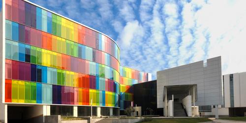
I was always interested in glass in architecture, especially as I learned more about its properties (solar control, safety, insulating, etc.). But I was very excited when I learned about Vanceva® interlayers. I could not believe the images of color I was seeing when I was first introduced to the product. I went crazy! It was then that I began using glass and color throughout all my projects, including walls, mirrors, doors—everywhere. And then the phone and emails took off. Everyone wanted to know where they could get that color in glass!
You won several awards from the former Solutia Design Awards (now Eastman) over the years. One of our all-time favorites was the Glass Garden. Can you tell us about that project?
This project is the love of my life because it was the first time I worked with a construction with only glass. I can say that was a very different and complex job, butthe result was certainly worth all the effort and dedication. I also won for a glass garage and a glass shop, so I became (part of the) jury!
When working on a design project that involves Vanceva, where do you begin?
To use this type of glass in the project, I must think about the entire composition, including the interior, the landscaping, and lighting so that the project is harmonious. The colored glass must start from the aesthetic sensitivity. In my case, I have a facility to compose because I love working with the colors.
What is your advice for a designer who has never used a bold color in a project?
Do not do anything that is too difficult to change, as you may regret it. For the rest, use your imagination! Nowadays, the market is full of products to change the face of the house with simple solutions. Start with pillows, curtains, rugs, vases; they will already make a big difference without changing radically. If you want a highlight for the background, paint a wall with a color. Another tip is to choose flowers to brighten up the house. This can't be missing: love!
You received a most unusual award when the toy company Mattel created a Barbie (Barbi) in your honor. Can you tell us about that experience?
It was an honor for me. I have had a strong relationship with Barbie dolls for years. Proof of my passion for this icon are the more than 400 dolls I have collected since 1992. So this recognition was very special. I felt like a real-life Barbie!
During this pandemic, what colors do you recommend for people to use in their homes?
Colors significantly influence our lives. This moment we are (currently) living has required a lot of reflection, calm, and care. Therefore, I recommend the use of more relaxing colors like pastels but with a warm palette, which refers to natural lighting, outdoors. Turquoise and earth tones are good options.